
Day 059 of Daily UI Challenge
What - Terms and Conditions
Why - With terms and conditions I designed it to be straightforward. Bolding the headers of each term and
condition so there is hierarchy, and having different colors between
primary and secondary buttons.

Day 058 of Daily UI Challenge
What – Designed a Product Tour
Why – For this product tour, I focused on the essentials: a strong hero image to showcase the product, its name, price, a clear call-to-action to buy, and a learn more button. The goal was to capture the user’s attention with a clean, engaging layout—providing just enough information to spark interest without overwhelming them, encouraging further exploration through the learn more option.

Day 057 of Daily UI Challenge
What - Designed a News Interface
Why - I created a news article layout focused on AI for this prompt. To make the content more engaging, I included key elements like a clear title, the author’s name, and a compelling image. I also added a small but thoughtful UX feature: an estimated reading time. While not essential, it’s a helpful touch that I wish more articles offered to improve the overall user experience.

Day 056 of Daily UI Challenge
What - Design a Frequently Asked Questions Page
Why - I designed a Frequently Asked Questions page with usability and clarity in mind. Instead of hiding answers behind expandable sections, I made all answers immediately visible—reducing the need for extra clicks and making information quicker to find. To enhance scannability, I added relevant icons following each question, giving users a visual cue about the topic before even reading the text. As a final step, I included a support component at the bottom of the page with a clear, eye-catching call-to-action button, so users can easily reach out if they need help.

Day 055 of Daily UI Challenge
What - Curated For You
Why - Inspired by the daily news feed on my phone, I redesigned the experience to feel more personalized and intentional. Instead of showing random content, I organized the feed by categories based on user interests. To make the experience even more tailored, I included a like feature so users can easily indicate what content they enjoy, helping refine future recommendations. I also added small but valuable daily insights—like the local weather and upcoming sports games—to make the feed more relevant and engaging.

Day 054 of Daily UI Challenge
What - Create New
Why - I designed a prominent Create New button as the user’s primary starting point when initiating a new action. To draw attention, I used a bright color, signaling that this is the first step in the process. Below the main button, I included additional options to guide users on what actions they can take after clicking Create New. I also added a small plus icon to visually reinforce the button's purpose and make its function immediately clear.

Day 053 of Daily UI Challenge
What - Button Design
Why - I created a variety of buttons commonly found on websites and apps. This included primary and secondary buttons—primary buttons served as the main call-to-action (CTA) to drive user engagement or sales, while secondary buttons provided alternative actions, like continuing to browse. I also designed toggle buttons with clear visual cues to indicate “on” and “off” states using contrasting colors. Additionally, I explored two states for submit buttons: one inactive version for when a form is incomplete, and an active version for when all required fields have been filled out.

Day 052 of Daily UI Challenge
What – Designing Leaderboards
Why – I wanted to highlight the number one artist for a top artist leaderboard, making their achievement stand out. To achieve this, I increased the size of the play count and changed the font color for the top spot, artist name, and play numbers. Since a leaderboard represents a significant accomplishment, I added orange circles in the background to enhance visual appeal. However, I maintained consistency across all ranks by keeping the artist name, profile, and play count uniform, ensuring users could easily navigate and understand the rankings as they scrolled.
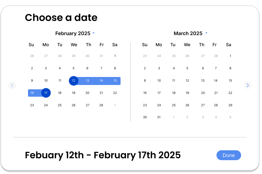
Day 051 of Daily UI Challenge
What - Designing a Date Picker
Why - I designed the date picker to display two months side by side, allowing users to easily select a date range that spans months. Navigation arrows enable users to quickly switch between months, while additional arrows by the year provide even more flexibility. To enhance clarity, I used a darker color to highlight the start and end dates, making the selection process more intuitive.

Day 050 of Daily UI Challenge
What – Designing a Status Update
Why – I designed the status update to be light and engaging by incorporating colors and icons, making the experience more enjoyable. The goal was to provide users with a clear and fun way to acknowledge their download completion while maintaining ease of use. I included a cancel button in the top right for quick dismissal and used primary and secondary buttons to differentiate user choices. Icons were added to make the update more visually appealing and less mundane.
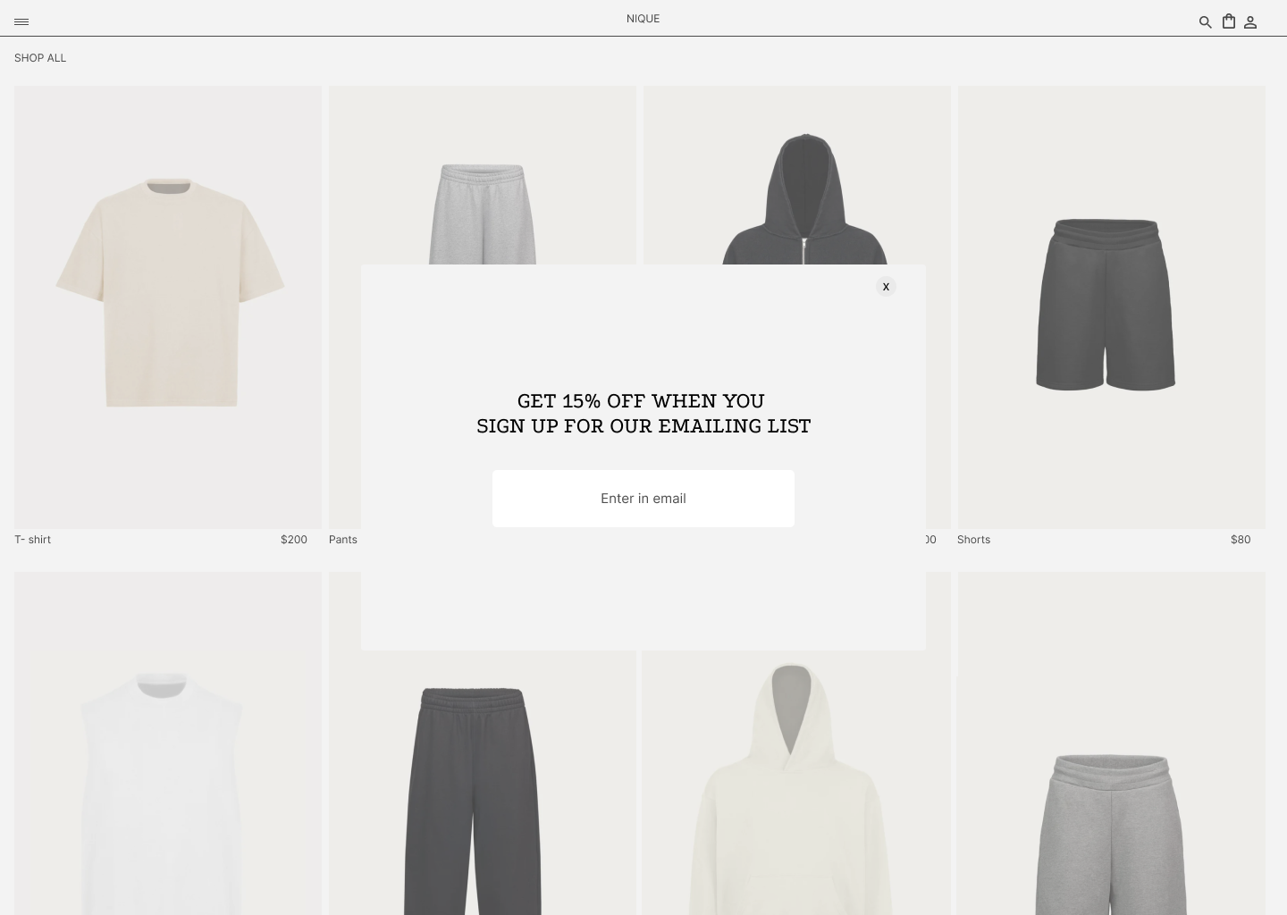
Day 049 of Daily UI Challenge
What – Designing a Pop-Up Overlay
Why – I created a pop-up overlay for a clothing website, as it’s a common and effective way to promote email sign-ups with a discount offer. To keep the design user-friendly, I added a subtle background filter to dim the website, making the pop-up stand out. The overlay communicates the discount details and includes a simple email entry field. Additionally, I placed a close (X) button in the top right corner for easy dismissal if the user chooses not to subscribe.

Day 048 of Daily UI Challenge
What – Designing a Purchase Receipt
Why – The purchase receipt includes details such as the total amount, order number, date, and card type. To enhance usability, I added a section listing the purchased items and a QR code for quick receipt downloads. The color scheme remains minimal and professional to keep the focus on essential information. Additionally, I included social media links to utilize space effectively while encouraging users to return and shop again.
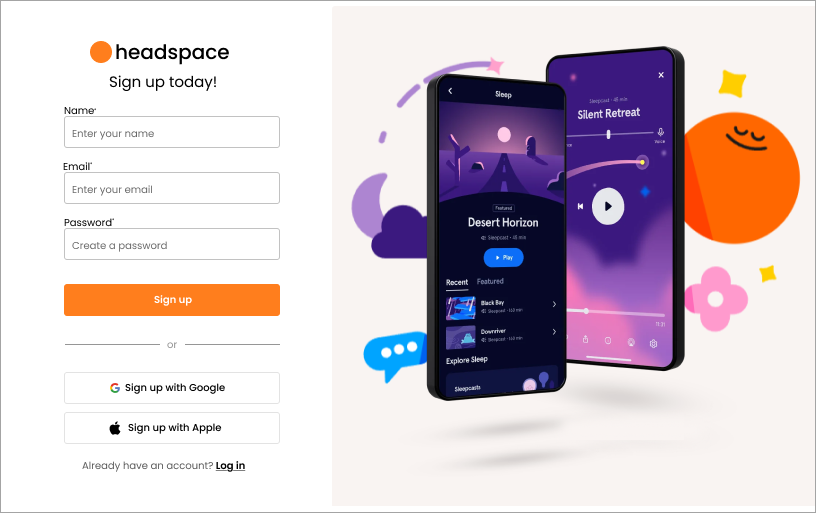
Day 047 of Daily UI Challenge
What – Designing a Sign-Up Page
Why – The sign-up page collects essential user information to create an account, including name, email, and password. To enhance convenience, I added quick sign-up options with Google and Apple. While primarily a sign-up page, it also functions as a login page with a link at the bottom for returning users. The design includes a logo at the top and a hero image on the right to clarify the page's purpose and ensure a seamless user experience.

Day 046 of Daily UI Challenge
What – Designing a Pre-Order Page
Why – The goal of the pre-order page is to make the product the focal point, building excitement and encouraging users to place an order. I structured the page to first showcase the product name, followed by key features and the release date. To drive action, I included a bold pre-order CTA, making it easy for users to commit.

Day 045 of Daily UI Challenge
What – Designing an App Download Page
Why – The goal of the app download page is to capture attention with a compelling header, followed by a concise description of the app’s purpose. To make downloading seamless, I included direct links to the Google Play Store and Apple App Store. Additionally, I showcased a few app screens against a blue background to highlight the visuals and enhance engagement.

Day 044 of Daily UI Challenge
What – Designing a Social Share Feature
Why – I designed the social share feature to include the article's name, options for sharing with contacts, and quick-access social media links. If none of these options are available, users can simply copy the link for easy sharing. This approach gives users flexibility in how and with whom they share content. To enhance visibility, I added a grey filter over the article and behind the social share component, ensuring the focus remains on the sharing options.
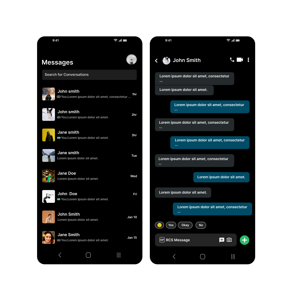
Day 043 of Daily UI Challenge
What - Design direct messaging
Why - With direct messaging I added what I found to be essential such as:
the name, a preview of the message, how long ago, and a profile icon to give the user more personality. I also added a nice bonus feature to show whether the recipient had seen the user’s text.

Day 042 of Daily UI Challenge
What – Designing a Redeem Coupon Feature
Why – A coupon redemption feature needs to include a field for entering the coupon code, an apply button, and clear feedback on whether the coupon was successful. When a coupon is applied, the discounted amount appears in red within the pricing section to make the change more noticeable. The apply button is grayed out after a successful redemption to prevent reuse. Additionally, a confirmation message pops up to inform the user that the coupon has been successfully applied.

Day 041 of Daily UI Challenge
What – Designing a Video Player
Why – I included the essential controls: rewind, forward, play, volume, and skip, ensuring a smooth viewing experience. I added secondary features like cast to screen, settings, and Full-Screen Mode to enhance functionality. I also prioritized accessibility and convenience by incorporating closed captions for better inclusivity. Drawing inspiration from platforms like Netflix and Crunchyroll. I refined the interface by adding an extra frame with reduced opacity, making on-screen buttons easier to read without distracting from the content.

Day 040 of Daily UI Challenge
What – Designing a Shopping Cart
Why – I focused on including the essentials: the items being purchased, quantity, individual prices, and the total cost.
To guide user actions, I made the member checkout button red to grab attention and serve as a clear call to action, while the continue shopping button acts as a secondary option.
For a logical flow, I positioned the product image on the left, followed by key details such as name, size, color, price, and quantity. I placed the order summary and checkout section to the right of these details for easy access. To enhance the shopping experience, I also added a "You May Also Like" section at the bottom, making the cart feel more dynamic and offering users additional choices.
Interested in seeing my other works? Click here!