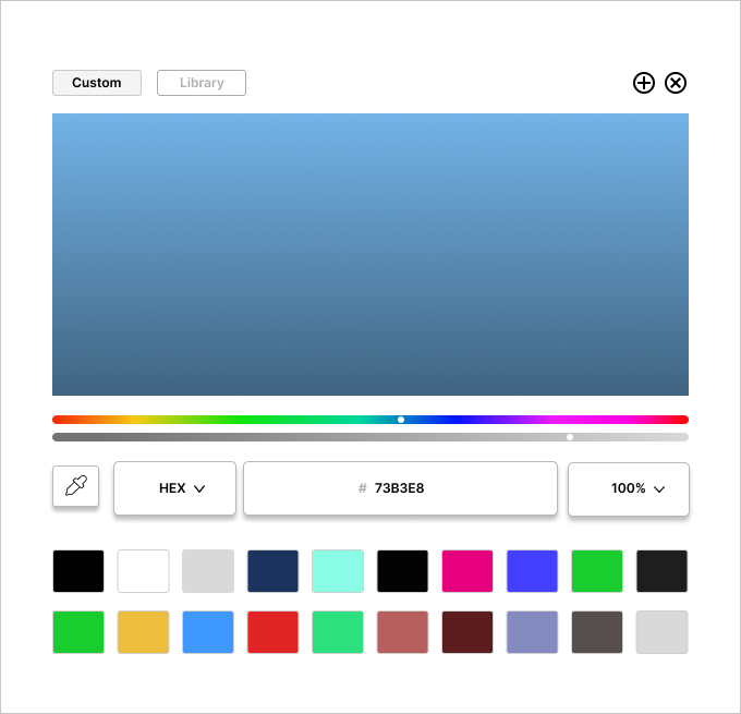
Day 039 of Daily UI Challenge
What - Design a color picker
Why - This was fun as I had never made a rainbow line before and had to learn how to make one on Figma.
I changed the custom font to be full black and the library to lighter grey to indicate which option the user is using.
I added a shadow to the buttons to separate them from the colors.
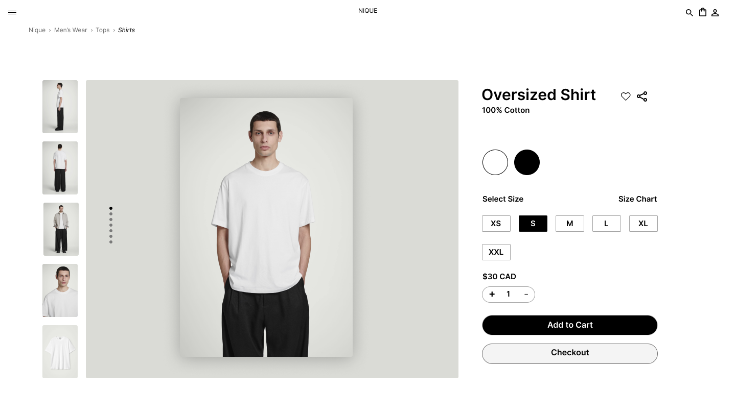
Day 038 of Daily UI Challenge
What – Designing Breadcrumbs
Why – I never realized that the navigation links leading up to your current page on a website were called breadcrumbs. I frequently rely on them, especially on sites like Canadian Tire or Home Depot, where browsing through countless products can be overwhelming. For this clothing store, I structured the breadcrumbs to start with Menswear, the broadest category encompassing all men's clothing. From there, users can navigate to more specific categories, such as T-Shirts. Like traditional breadcrumbs, this setup provides a clear path back to the main category. To enhance usability, I italicized the current page to give users extra visual feedback, and I included an arrow to indicate the next page in the navigation flow.
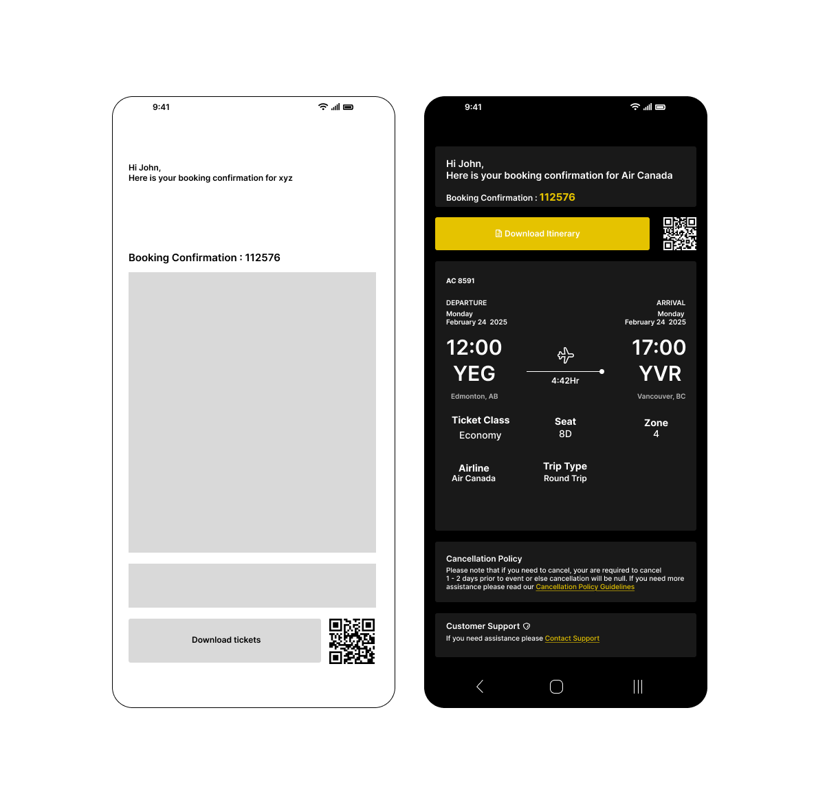
Day 037 of Daily UI Challenge
What - Design a Confirmation
Why - with a confirmation email, I added the vital things such as what the confirmation is for, the dates, and a button to download the tickets. I also included some secondary but nice additions: the company’s cancellation policy and customer support. I added an accent yellow to the buttons on the page to indicate that these are buttons.

Day 036 of Daily UI Challenge
What - Design a website Navigation
Why - I decided to try something I never did before, which is to have the navigation separated from the top of the website and separated.
Almost like a carousel flipping through each page; each one is visible from the moment the user lands.
It sounded like an easy layout till I realized I had to make 5 pages in one rather one single layout website page. I think this type of
navigation is functional and pretty neat as you get to see everything all at once and it should make navigating easier.

Day 035 of Daily UI Challenge
What - Designed a press page
Why - To keep the design aligned with Headspace’s brand, I used their signature colors: orange, grey, and blue. I kept the layout simple, featuring their logo, a brief description of their mission, and a clear call-to-action button for contacting the press team. Noticing that their current press page lacked visuals, I added icons to represent downloadable press kit resources, making it more intuitive. For the layout, I drew inspiration from Reddit’s press page, organizing content with text on the left, an image on the right, and media resources below the hero section. This structure is both visually appealing and easy to navigate.

Day 034 of Daily UI Challenge
What - Designed a music player
Why - I took a lot of inspiration from Spotify but made several adjustments to improve the user experience. One key change was adding a "like" button at the bottom that allows users to like a song without adding it to their playlist—perfect for those who enjoy a song but don’t want it on repeat. I also redesigned the artist and song placement, emphasizing the artist’s name to ensure they receive more recognition. Additionally, I included the album name directly in the interface, reducing the steps needed to find out which album a song belongs to.
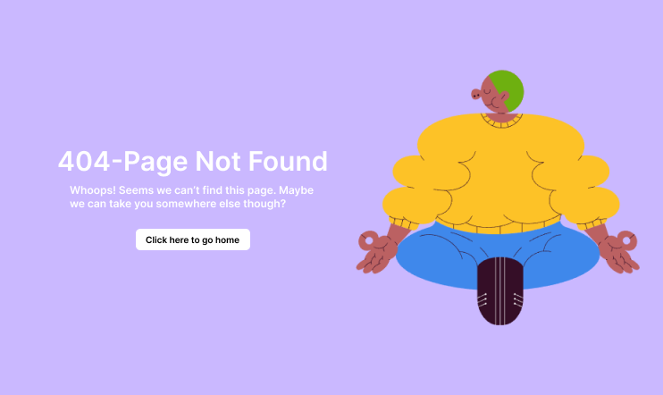
Day 033 of Daily UI Challenge
What - Design a 404 Page
Why - I don’t come across 404 pages often, but I see them as a fun opportunity to showcase personality or add a lighthearted touch to an otherwise frustrating experience.
Including a button that directs users back to the homepage makes navigation easier, eliminating the need to reload the site manually.
The meditating graphic, paired with the purple background, creates a calming effect, helping to reduce any frustration a user might feel when they can't find their intended page..
Day 032 of Daily UI Challenge
What - Logo Design
Why - I wanted to keep my logo super simple, hoping it represents me as a designer and keeps things minimalist.
I always used my initials as an easy way to create a logo and my branding.

Day 031 of Daily UI Challenge
What – Designing a job listing.
Why – I used strokes around keywords to create a clear separation between items. Essential CTA buttons feature icons to make them more noticeable, and I differentiated primary and secondary buttons with distinct colors.
To enhance readability, I increased the font size of important headers, such as the job title, job details, and company overview, ensuring they stand out.
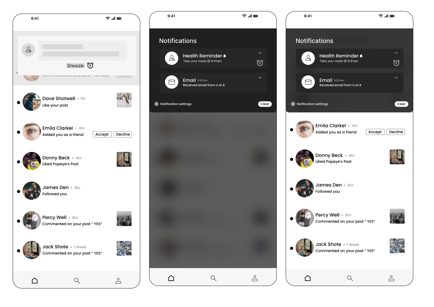
Day 030 of Daily UI Challenge
What - Design a Notification
Why - My phone’s notification system inspired me, incorporating essential features like a snooze button for reminders, a "clear all" option to dismiss notifications, and notification settings to control which apps or messages can send alerts. To enhance realism, I added a blurred background to simulate the experience of a notification appearing on-screen or being accessed by pulling down the notification panel. I also overlaid it on an app to replicate how notifications appear while a user is actively engaged in another task.
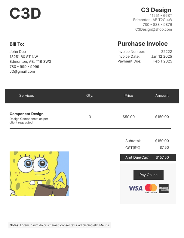
Day 029 of Daily UI Challenge
What - Design an invoice
Why - An invoice should have the essentials like who is paying, who is being paid, services provided, and how they will be paid for services. I added the vital information of who is paying and who is being paid at the top then working down to the services provided
ending the amount owed and options to being paid.
The layout of this invoice has a nice information architecture as you learn who the invoice is for, what it is for and how it is being paid.
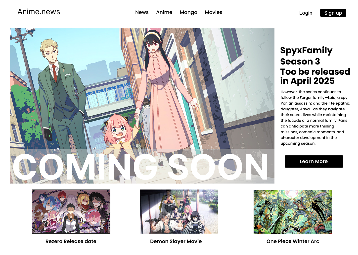
Day 028 of Daily UI Challenge
What - Design a Coming Soon Page
Why - I didn’t want to just do another countdown page for coming soon so I did a mock-up of an anime season coming page on a mock anime news website.
I added the coming soon in big bold letters and a layer between the image and coming soon to make the letters more visible.
I made the letters extra big and bold as they look nice, but they are also a big attention grabber along with the big hero image on the website.
I then put the body text to the right of the big hero image to give more context as to what the hero image is about and what is coming soon.
To make it feel like an anime page I added headers that were about movies and shows and at the bottom of the website, I added other anime mock-ups for shows and movies.
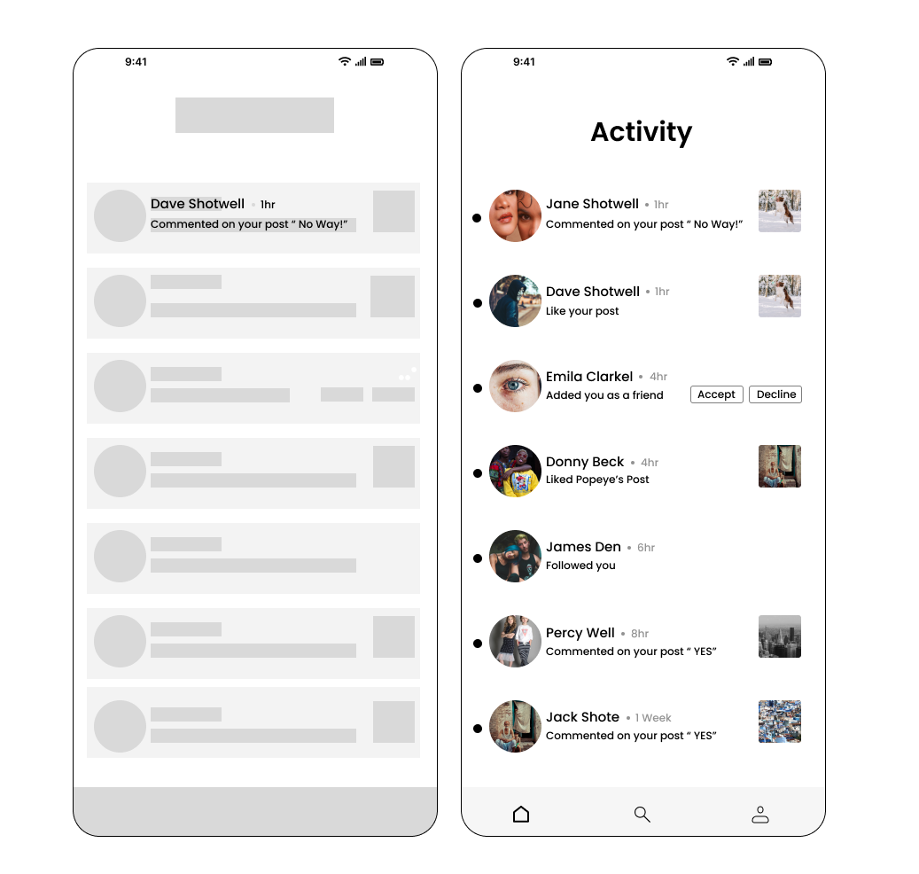
Day 027 of Daily UI Challenge
What - Design an Activity Feed
Why - I drew inspiration from Instagram and Facebook’s activity feed by including things like the user’s profile pictures and what activities they did like followed, liked, and commented on.
I added tots next to each profile picture to indicate a different person along with a different profile picture. I also added when the user did their activity next to the user

Day 026 of Daily UI Challenge
What - Design an Info Card
Why - I wanted to keep the info card simple with all the necessities. Things include name, level, when they were last on, and what games they play.
I chose a black theme so it would highlight all the necessities and you can quickly get a sense of what this person’s player tag in an instant.
With such a small info card I also made sure that spacing was all within 8 rems as the user may notice awkward spacing more with only so much to look at.
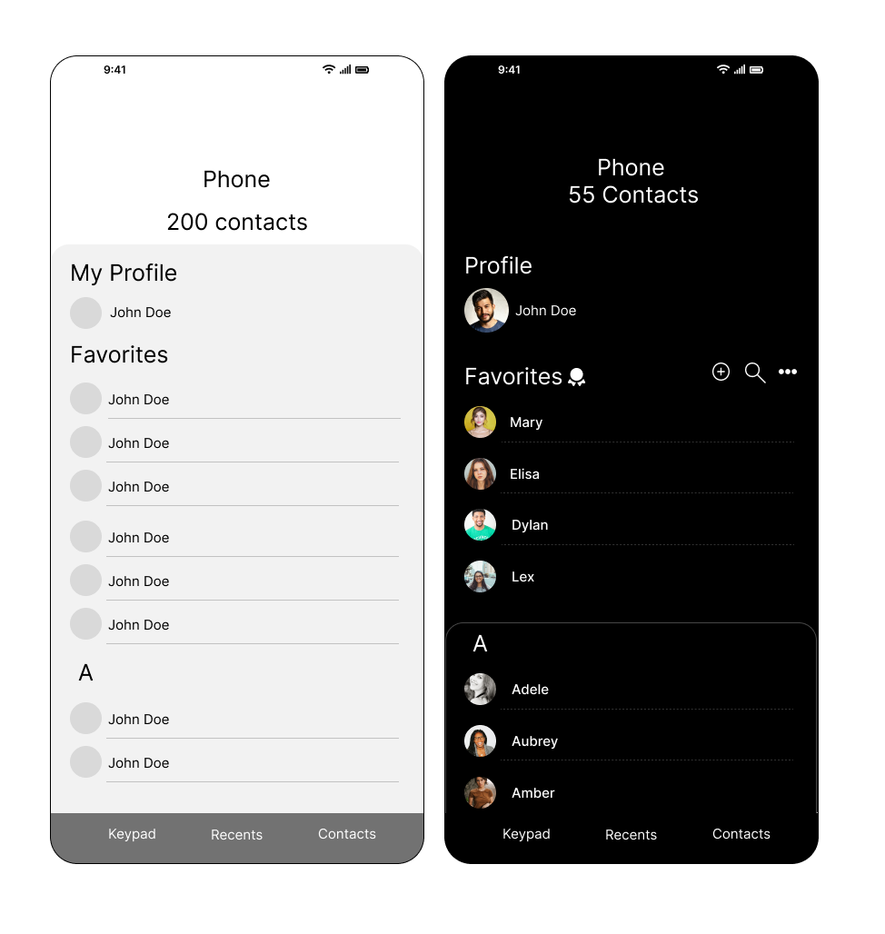
Day 025 of Daily UI Challenge
What - Design a Favorites List
Why - I added the little ribbon icon to emphasize the favorite’s contact list. I added a stroke to the card above the A to make it feel like a rolodex.
I used dotted lines instead of solid lines to make it a little more aesthetically pleasing. I chose a black background to leave more emphasis on the contact names.
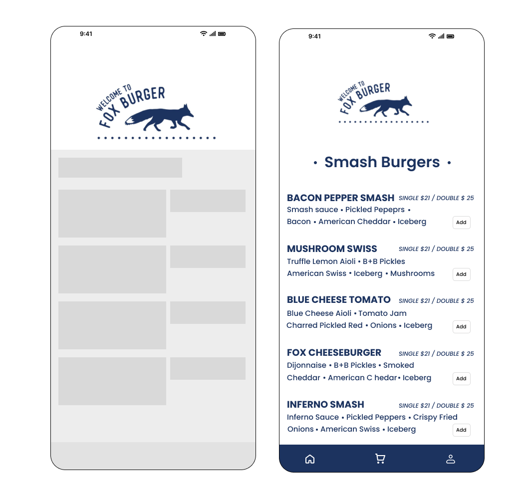
Day 024 of Daily UI Challenge
What - Food Menu Items
Why - I added a profile icon so the user could check out their history.
I bolded the names of the burgers to distinguish between the burger name and the ingredients.
I added a quick add button for easy adding to the cart.

Day 023 of Daily UI Challenge
What - Design a to-do list
Why - I added a calendar at the top so they would immediately know the date and tasks associated with that day.
I went green check marks on the side to indicate when a task has been cleaned and the white ones for when they are still
to be completed. Also added the line through functions to show that they have been completed
I added the big add button on the corner to free up space from the bottom nav bar but also ease of access.
The underline under All was to indicate that the current page was displaying both tasks and reminders but having both categories
next to All indicated that you can go into separate categories.
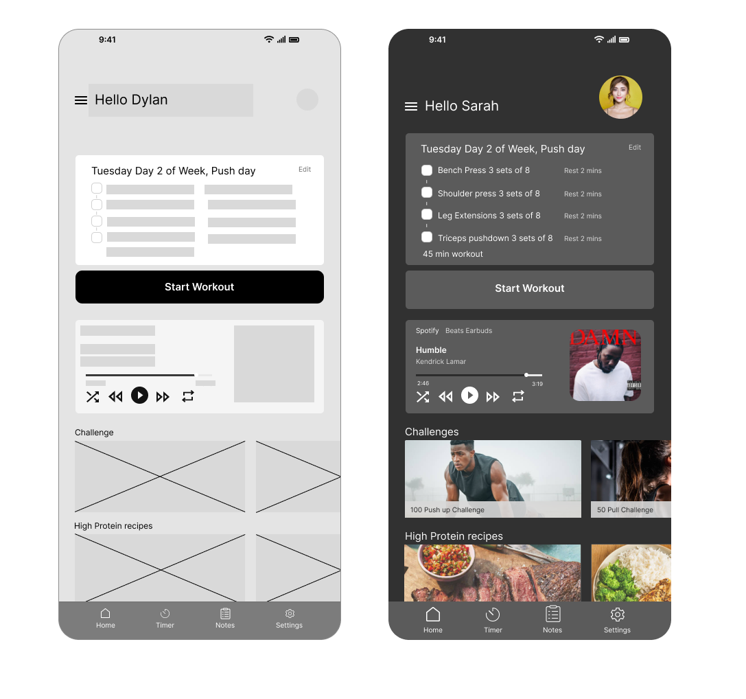
Day 022 of Daily UI Challenge
What - Design a Workout page
Why - my idea was to have everything a person working would want in one app. It has a workout plan, music, a timer for in-between sets,
challenges if they get bored, and recipes for refueling afterward.
I also added notes so they could write down how hard the workout was and what felt off or felt better this time.
I added an edit button so they can adjust their workout immediately. I changed the color of secondary information, such as rest for 2 mins, beats earbuds, and Kendrick
, as they are not as vital information but still need to be there

Day 021 of Daily UI Challenge
What - Design Testimonials
Why - with testimonials there are so many different types that are viable. The name can go first and immediately their rating and description or rating description and then name.
You could have the image on the card, in the middle of the card, or on top of the card, all for different styles.
I believe my favorite is name, rating then description. I chose this one because it shows important details at a glance. You get the person and their rating, the description can
be subjective. I also like having the avatar in the middle of the card with the white background as it adds a different style choice and is a bit more fun. Not so professional but
artistic.

Day 020 of Daily UI Challenge
What - Design a Food Recipe
Why - With this page I wanted the user to get the gist of what is needed and what they were cooking at a glance.
So the food they were cooking is at the top, how long to prep and cook, servings, ingredients, and a quick video to show how to make the recipe right away.
I highlighted buttons to indicate how many servings there are and how to save the recipe.
I added a filter over the film to make the play button stand out a bit more and not blend into the video making it
harder to see. Lastly, I added a search button for the user to be able to quickly search for ingredients or recipes.
Interested in seeing my other works? Click here!